January 26, 2013
![]()
I’ve an odd bunch of covers for you this week. It isn’t the artwork, which in some cases is quite good. It is the subject matter. Comic covers are supposed to bring in readers. They should catch the eye and intrigue the mind. I’ve picked five Hulk covers that I feel would do nothing to make a casual fan pick up the issue. In fact, if I was thinking of dropping the title, these covers might be enough to make me not buy the title again. I see no way these covers could possibly have increased sales. Other than the last, I present these in no particular order.

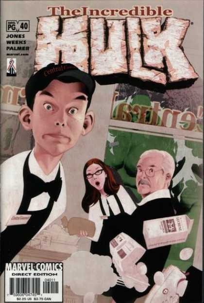
“How nice, a Norman Rockwell homage.” Pass.
“Oh, I hope those eggs don’t crack.” The Hulk is not the focus of this cover. In fact, you have to look closely to see him. I wonder how many fans scanned the racks for The Hulk and then asked the guy behind the counter why The Hulk didn’t come in this week. Even the logo blends in too easily. This cover simply makes the comic too easy to miss.
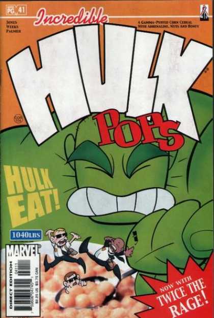
“Marvel Kids is back?” Pass
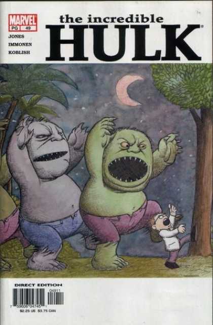
“So what is this book about now?” The Hulk (the book, as well as the character) went through so many changes in such a short period that readers could be forgiven if they actually believed that this was a Hulk version of Where The Wild Things Are.
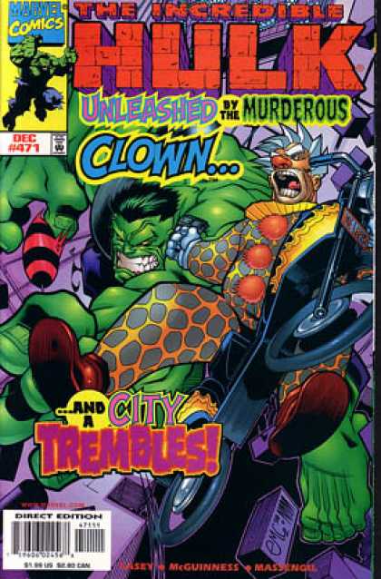
“Um, the Hulk is fighting a clown????” ‘Nuff said.


I’m thinking….. Maybe there should be classes in marketing graphic novels / comic books – making the covers appeal to the reader. Maybe they felt like experimenting.
LikeLike
I’m not a firm believer that a cover has to reflect the story inside, though I think it should, but I think there has to be something appealing about a cover that would make someone who was not already reading the title want to give it a try.
LikeLike
Packaging & labeling counts for a lot – Even generic products like fruity – Oatie – Circles try to add a little OOMPH ( ! ).
LikeLike