May 6, 2014
This blog has been on WordPress since 2009. It has been around a lot longer than that, but you had to be on MySpace to see it, and we all know what happened with that site. So when everyone upped and moved out of MySpace one day, leaving me all alone (“Hey, where’d everyone go? Huh? What’s a “Facebook”?) I moved most of my old posts over to WordPress and continued on.
But while the posts were the same, the look was not. Although I didn’t keep any screencaps, I found a lot of old images of the blog on the Internet Archives site. Here is a smattering of the old looks of Mr. Blog’s Tepid Ride.

Here we are, back in November of 2009, and I love the white text on a black background. However, I got a few complaints that it was hard to read so that didn’t last long. There are a few things worth mentioning here. First, the header. I took that picture myself in Coney Island. Since then, Astroland has been sold and the rocket has gone with it. If you go there today the burger boy is still there, but the rocket is long gone. The header also features one of my old taglines, “It is what it is.” We’ll see some more tags later on. That page also features my old bio, before the current one written by Mac of BIOnighT.

This is from February 2010. The black background is gone and you can see a little more of the Coney Island header. (There is much more to that image, still unseen.) I liked this theme because it leaves the header image clean. The sidebar has one of my favorite “raves,” from Jim at relicradio.com.

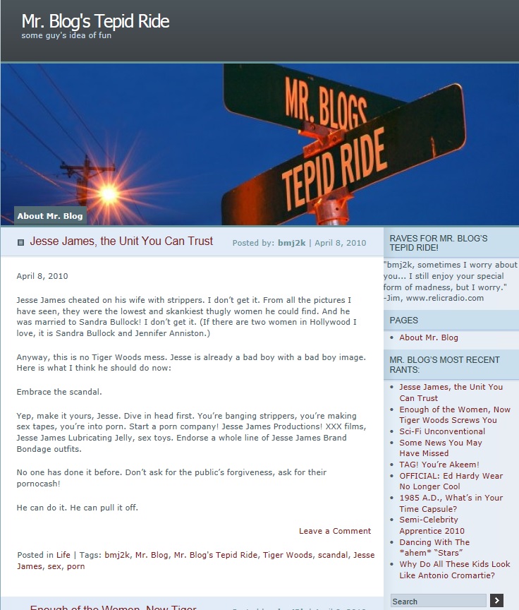
This is April 2010 and we’ve gone to a more modern header. In fact, I’m currently using a variation of that header right now. Do you see the grammatical error in this one? It isn’t really an error. At the time this was made, the software didn’t support apostrophes. I figured it looked good and no one would notice. The tag has also changed, to “some guy’s idea of fun,” which I still think sums this blog up.

June 2010 and we’re starting to look familiar. I changed to the current theme, but I’m using one of the generic WordPress color schemes. The tag has changed once more, to “Based on the novel “Mr. Blog” by Sapphire,” which is making me chuckle as I type but may be too dated to reuse.

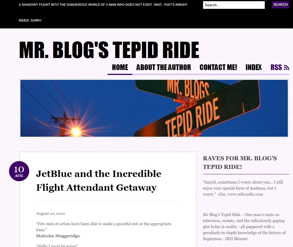
August of 2010 brought a new tag (“A shadowy flight into the dangerous world of a man who does not exist. Wait- that’s Knight Rider.”) as well as a new “rave,” from the multi-talented JRD Skinner of flashpulp.com. He picked right up on my Superman obsession. There is also a “contact me!” link, which today can be found at the bottom of the “About me” page. I have to warn you, though- now, as then, I never check that email. All I ever get is spam about people wanting me to run their ads.

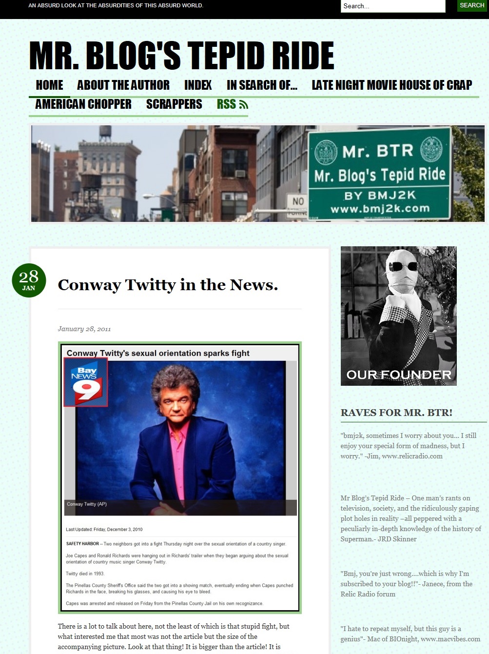
January of 2011 and I’ve changed to the green color scheme, which won’t last long. The tag has also changed to something close to my current tag. The header image is the first of a few city scenes and highway signs I’ve used over the years. This version of the blog added a few new pages, including the Scrappers page which is mercifully long gone. I added the Invisible Man founder image, and it popped up once or twice more over the years. I also wasted a lot of space with more “raves,” none of which appear on the blog anymore due to, quite honestly, my embarrassment. This particular Conway Twitty post still gets a ton of hits and the occasional angry comment.

In April 2011 I added the custom background which looks a lot better now than it does here. It still isn’t quite finished yet, but this is close to the way the blog currently looks. The founder is gone, replaced by my teaser (and I still love that ad) for the return of Mr. Know-It-All.

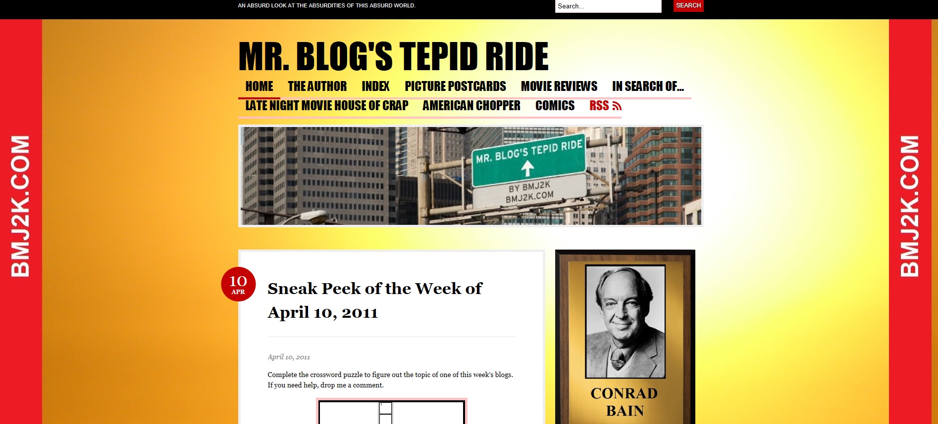
Here we are. I added the sidebars, and there’s my Conrad Bain plaque. (Why? Why not?) You can also see an early version of the long running city header, which ran for longer than any other image.
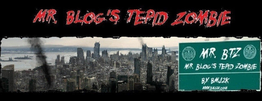
There have been some other changes along the way, including a ton of American Chopper headers, and the Tepid Zombie header, which I still dust off when appropriate.

By the way, here’s the full Coney Island rocket header:

The graffiti on the windows is my addition, but the rest of the building looks the same if you go there today, except for the rocket.
The blog hasn’t changed much in the last three years. The tag changed yet again, and there are some other small alterations. The site is due for another change, but no matter what, I promise not to go back to the white letters on black background.
If you like what you see, please share this:
Tags: archives, blog themes, blogging, bmj2k, Coney Island, Conrad Bain, Conway Twitty, Facebook, headers, history, Invisible Man, Knight Rider, Mr. Blog, Mr. Blog's Tepid Ride, Mr. BTR, Mr. Know-It-All, MySpace, Sapphire, Scrappers, Tepid Zombie


Your Comments